- 한국어
- English
- 日本語
- 中文
- العربية
- Español
- Français
- Deutsch
- Pусский
- Tiếng Việt
- Indonesian
By Honorary Reporter Ayushi Kharayat from India
Photos = Ordinary People
Ordinary People is a Seoul-based multi-disciplinary design studio specializing in brand strategy and art direction. It is best known for art direction, album packaging and graphic design work for big-name K-pop acts like BTS and NCT, with its influence also shaping recognizable domestic brand identities from Olive Young to Korean content on Netflix.
The following are excerpts from an email interview with Lee Jaeha, Co-Founder of Ordinary People, from March 20, 2025, to April 30 this year.
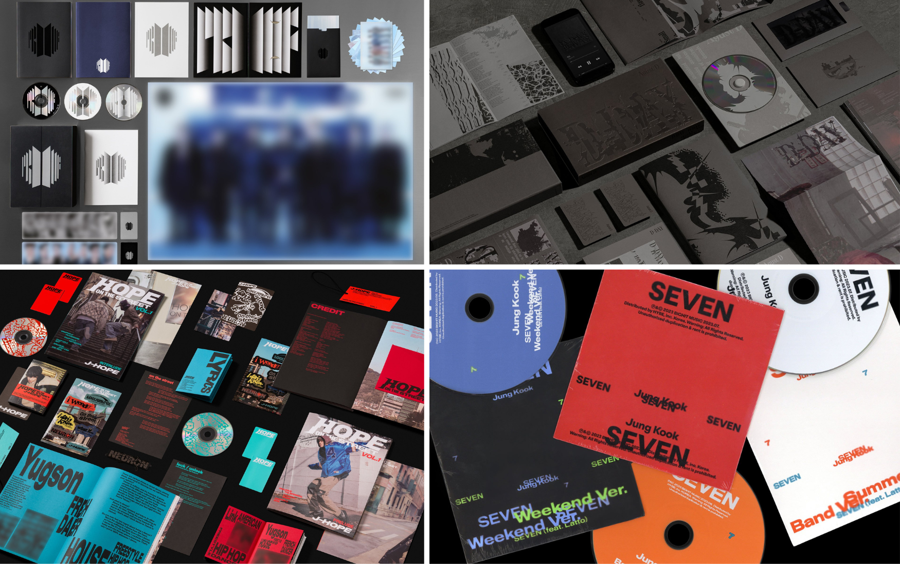
Clockwise from left are album artwork and packaging designed by Ordinary People for BTS' "Proof" (2022), Agust D's "D-Day" (2023), Jungkook's "Seven" (2023) and J-Hope's "Hope on the Street Vol. 1" (2024).
How did you translate BTS' nine-year journey and transition into the visual identity of "Proof?"
Our approach to the album focused on understanding and honoring what this moment meant for BTS and its fans who were part of that journey. To us, it felt like a declaration that everything BTS built over the past nine years was meaningful and continues to evolve.
How did you develop the visuals for projects with K-pop acts?
Each project required a different visual approach based on each unique identity. Jungkook's "Seven" emphasized global pop appeal and urban sophistication, while Agust D's "D-Day" focused on inner conflict and introspection. J-Hope's "Hope on the Street Vol. 1" highlighted his roots as a street dancer and his sense of musical freedom, allowing his personal narrative to come through vividly.
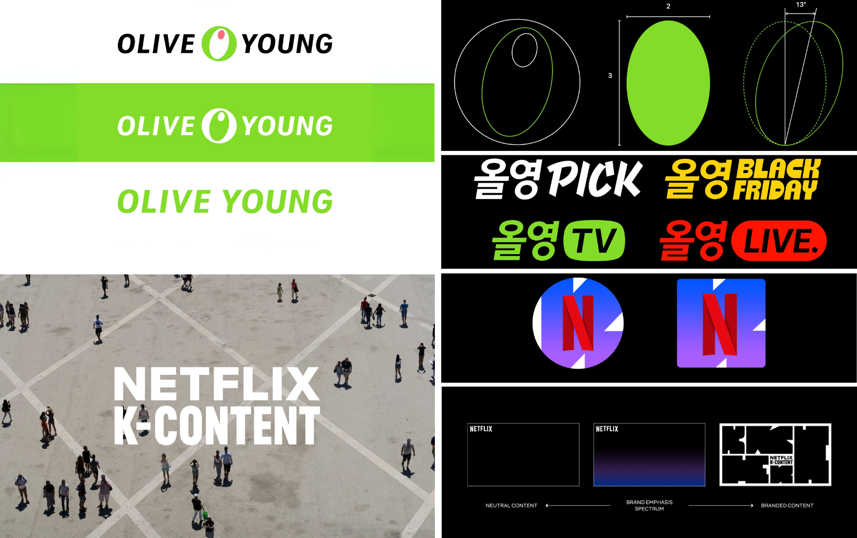
Brand identity systems designed by Ordinary People in 2023 for Olive Young (top) and Korean content on Netflix
How did the "cultural square" concept shape your visual approach for Netflix?
We approached the project through the idea of a cultural square, an open space where global audiences connect through K-content. This concept guided the overall visual direction. We designed the "K" not simply as a logo but as a flexible visual framework adaptable to different genres, moods and fandoms. It is also designed to evolve alongside the stories it represents.
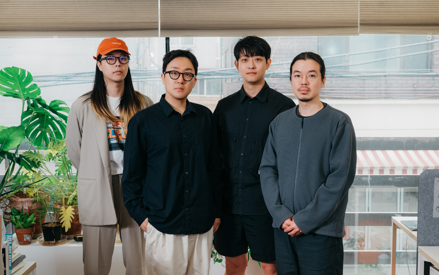
Ordinary People staff (from left) Kang Jin, Seo Jungmin, Lee Jaeha and Ahn Seyong in June 2025 pose at the studio's office in Seoul.
What inspired your name and how does it reflect your design philosophy?
The name came to us in a natural moment while listening to John Legend's song "Ordinary People." It captured something essential about our approach: Great design doesn't have to be flashy or loud. Today, the name reminds us to focus on clarity, sincerity and designing with people in mind.
For young creatives in design, what advice do you have?
Create something now and show it to people. More than one great outcome, we believe that the act of consistently creating and sharing marks a true beginning.
ljyhwa@korea.kr
*This article was written by a Korea.net Honorary Reporter. Our group of Honorary Reporters are from all around the world, and they share with Korea.net their love and passion for all things Korean.