-
 Korea.net's 24-hour YouTube channel
- NEWS FOCUS
- ABOUT KOREA
- EVENTS
- RESOURCES
- GOVERNMENT
- ABOUT US


- 한국어
- English
- 日本語
- 中文
- العربية
- Español
- Français
- Deutsch
- Pусский
- Tiếng Việt
- Indonesian
By Honorary Reporter Foteini Chatzoudi from Greece
Photos = Lee Do-eui
Brenden, a Seoul-based design company founded in 2019, is the brains behind the logo for "Seoul, My Soul," the slogan of the capital released in August last year.
The company collaborated with the Seoul Metropolitan Government to make the logo for creating a globally recognized tourism brand. "Seoul, My Soul" on March 10 earned the City Branding Award at this year's iF Design Germany, one of the world's top three competitions of its kind after the Red Dot Design Awards also of Germany and the International Design Excellence Awards of the U.S.
Brenden is the recipient of other honors including the Red Dot Design Award in branding and the iF Communication Award.
In an e-mail interview from March 11-18, Brenden CEO Lee Do-eui said the essence of branding Seoul was capturing the lifestyles, images and moods of its inhabitants.
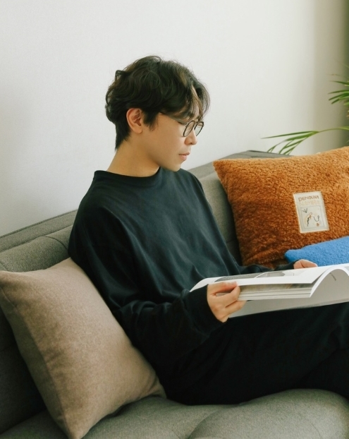
Lee Do-eui is the CEO of the Seoul-based design company Brenden.
He said Brenden needed to design a singular visual element that encapsulates the multifaceted nature of the capital's landscape, so it created a logo based on the concept of "Seoulites' hearts."
"Considering Seoul's expansive size and diverse functions, our task was to create a singular visual symbol," Lee said. "As a result, our foremost objective was to create something transcending mere aesthetics, connecting with individuals of all ages and backgrounds, and ensuring universal relatability and comprehension."
On the symbols used in the design, he added, "The pictograms featured in the logo represent love, inspire and fun. The heart symbolizes Seoul as a city of love that unites people, the exclamation mark a city full of inspiration and the smiley face a city of fun filled with beautiful experiences."
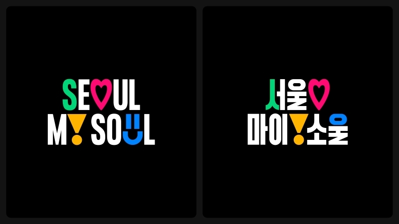
The global version of the "Seoul My Soul" logo is on the left and on the right is the domestic version.
In addition to the global version of the logo, Brenden made another for Seoul residents in Hangeul. The domestic edition maintains visual consistency with the typography of the former by using key visual elements such as thickness and curves.
msjeon22@korea.kr
*This article is written by a Korea.net Honorary Reporter. Our group of Honorary Reporters are from all around the world, and they share with Korea.net their love and passion for all things Korean.
Most popular
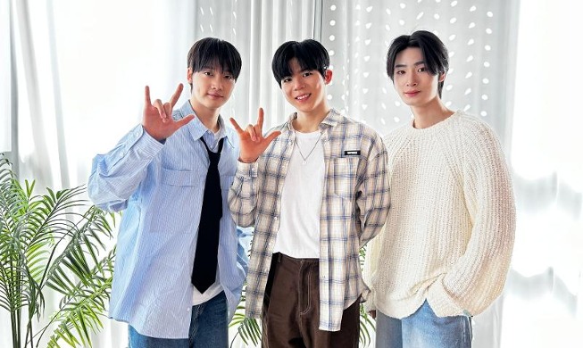
- First hearing-impaired K-pop act hopes for 'barrier-free world'
- 'Mad Max' director impressed by 'cinema-literate' Korean viewers
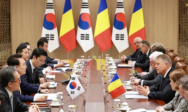
- Romanian presidential couple visits national cemetery
- 'Korean mythology is just as wonderful as Greek and Roman'
- Hit drama 'Beef' wins awards from 3 major Hollywood guilds